
優先順序
inline > internal = external
id > class > element(p, div...)
因為Id具有不可重複性,所以層級>class
Selector
| selector | example |
|---|---|
| #id | #name |
| .class | .p |
| * | * {} select all elements |
| , | div, name, p |
- Inline styles - Example:
- IDs - Example: #navbar
- Classes, pseudo-classes, attribute selectors - Example: .test, :hover, [href]
- Elements and pseudo-elements - Example: h1, :before
id selector
#text1 {}
An id name cannot start with a number!
class selector
.center {}
選擇特定元素的class
p.center{}
可以設定多class
<p class="center large" />
universal selector
* {}
',' stand for or in selector
h1 {
  text-align: center;
  color: red;
}

h2 {
  text-align: center;
  color: red;
}

p {
  text-align: center;
  color: red;
}
=
h1, h2, p {
  text-align: center;
  color: red;
}
Insert CSS
- External
inside<head> <link rel="stylesheet" href="style.css" </head><head>
rel: relationship,固定表示是樣式表
href: hyper reference 超連結 引用外部的資源 - Internal
使用style標籤<style> body { background-color: linen; } h1 { color: maroon; margin-left: 40px; } </style> - Inline
internal與external的優先看誰的順序更後面,先出現的會被覆蓋掉<p style="color:red;">This is a paragraph.</p><head> <link rel="stylesheet" type="text/css" href="mystyle.css"> <style> h1 { color: orange; } </style> // style比external後面,h1的樣式會是橘色 </head>
<head>
    <style>
        h1 {
          color: orange;
        }
    </style>
    <link rel="stylesheet" type="text/css" href="mystyle.css">
// external的順序在style後面,如果external定義了h1樣式,會跟著h1的設定走
</head>
backgroud
background repeat
background-repeat: repeat-x; // repeat horizontally
background-repeat: repeat-y; //repeat vertically
使用background-image默認就是
background-repeat: repeat-x repeat-y
除非使用background-repeat
- no-repeat
- repeat-x
- repeat-y
background position
- top
會貼齊上方,水平置中 - right
如果沒有配上top right使用,上方可能被遮蓋

- bottom
If you only specify one keyword, the other value will be "center"
background attachment
指定圖片是否要跟著scroll-bar移動
位置在頁面上的位置固定,不會隨著滾動條被滾走
{background-attachment: fixed}
隨著滾動而滾出視線
{background-attachment: scroll}
shorthand
可以用一行來省略background
body {
  background-color: #ffffff;
  background-image: url("img_tree.png");
  background-repeat: no-repeat;
  background-position: right top;
}
to
body {
  background: #ffffff url("img_tree.png") no-repeat right top;
}
需要按照順序,中間有屬性缺少沒關係
- background-color
- background-image
- background-repeat
- background-attachment
- background-position
background clip
background-color的作用範圍延伸到哪裡
- border-box
默認,除了margin外的內容都受影響 -> 延伸到border - padding-box
延伸到padding -> padding受影響 - content-box
只有content才受影響
延伸到content -> 只有content受影響
background origin
和 background clip類似,差別在於image從哪展開
以及默認為padding-box
Margin
Margins are used to create space around elements, outside of any defined borders.
四個值:top right bottom left
三個值:top left+right bottom
兩個值:top+bottom left+right
auto
塊級元素自動撐滿整行,所以可以用margin: auto;來自動平分左右的寬度,實現水平居中
常見的塊級元素 div、h1-h6、form、p、li、ol、li、dl、dt、dd、address、caption、table、tbody、td、tfoot、th、thead、tr
三大列表和表格、六大标题和表单、段落地址要分块。
如果想使用margin: auto實現垂直水平居中,需要外頭有父元素指定高度
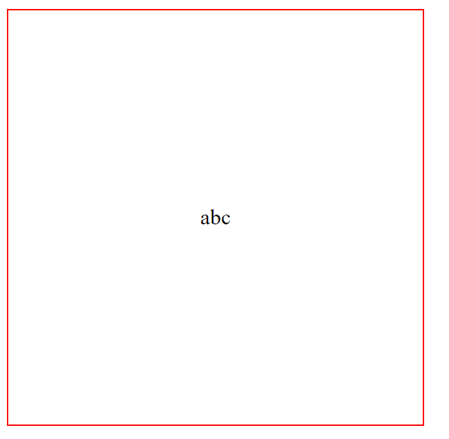
<div style = "display: flex; height: 1000px; border: 1px solid red;">
    <div style = "margin: auto;" >
        abc
    </div>
</div>
效果
inherit
可以強制繼承屬性
Margin Collapse
上下的margin交疊時會合併(塌陷)成大的那一個,左右Margin不會
height width
height and width properties do not include padding, borders, or margins! They set the height/width of the area inside the padding, border, and margin of the element!
- %是取整個browser的比例
max-width max-height
default value: none -> there is no maximum width / height
max-width / height的優先級 > 一般的width / height
CSS Box Modal
margin + border + padding + content
setting height or width is setting only for content
Outline
在border外的line to make elements stand out
Outline differs from borders! Unlike border, the outline is drawn outside the element's border, and may overlap other content. Also, the outline is NOT a part of the element's dimensions; the element's total width and height is not affected by the width of the outline.
shorthand: 順序 width -> style -> solor
style是必須的
Text
- text-align
- right
- left
- justify
- text-align: justify 平分該行的寬度
w/text-align: justify

withouttext-align: justify
- text-align-last
specifies how to align the last line of a text.
- direction
- rtl
- ltr
direction: rtl / ltr 單獨使用實現的效果和text-align: right一樣,需要與unicode-bidi: bidi-override;搭配使用才能實現對齊右邊 ehT
的效果
## text transformp.uppercase { text-transform: uppercase; } // THIS TEXT IS TRANSFORMED TO UPPERCASE. p.lowercase { text-transform: lowercase; } // this text is transformed to lowercase. p.capitalize { text-transform: capitalize; } // This Text Is Capitalized.
Block Inline
block-level
- div
- h1 - h6
- p
- form
- header
- footer
- section
A block-level element always starts on a new line and takes up the full width available (stretches out to the left and right as far as it can).
inline-level
- span
- a
- img
隱藏元素
- visibility: hidden 元素不会触发绑定的事件。
- display: none 元素会直接从页面上消失,因此在该元素上绑定的事件不会生效。
- opacity: 0 只是元素變成透明,会触发绑定的事件,例如点击会触发click函数。
Position
- static
- relative
reletive to its normal position - fixed
relative to viewport, fixed at certain position - absolute
relative to nearest positioned ancestor. if no ancestor, it uses the document body and moves along with page scrolling.
會找最近的有被定位過(即除了position: static 以外屬性的元素)的元素進行絕對定位 - sticky
position based on user's scroll position
在滾動到將要移出視線時,規定屆時的位置
float
clear
When we use the float property, and we want the next element below (not on right or left), we will have to use the clear property.
For instance, a block element below floated element will overlap if not using clear.

clearfix
If a floated element is taller than the containing element, it will "overflow" outside of its container.
2 ways to solve
overflow: auto.clearfix::after { content: ""; clear: both; display: table; }
inline-block
Compared to display: inline, the major difference is that display: inline-block allows to set a width and height on the element.
Also, with display: inline-block, the top and bottom margins/paddings are respected, but with display: inline they are not.
Compared to display: block, the major difference is that display: inline-block does not add a line-break after the element, so the element can sit next to other elements.
| inline | inline-block | block |
|---|---|---|
| 不能設置寬高 | 可以設置寬高 | 可以設置寬高 |
| 不會自動佔滿整行 | 不會自動佔滿整行 | 自動佔滿整行 |
| 只有左右margin | 四周都可設置margin | 四周都可設置margin |
居中的方式
- 塊級元素水平居中
margin: auto塊級元素佔滿整行 -> 平分左右的空間 - 文字水平居中
text-align: center - 已知父元素高度,直接使用padding
文字line-height設為父元素高度,使一行佔滿 - 使用transform
.center p { margin: 0; position: absolute; top: 50%; left: 50%; transform: translate(-50%, -50%); } - 彈性盒子
display: flex;
justify-content: center;
align-item: center;
Combinators
- 空白鍵
有階層關係 div p 來選擇<div> <p /> </div> - child seletor >
選擇子元素空白與 > 的區別:空白表示相對的階層關係,中間可以跳級,而 > 必須是直接的子元素
<div>
  <p>Paragraph 1 in the div.</p>
  <p>Paragraph 2 in the div.</p>
  <section>
      <p>Paragraph 3 in the div.</p> // 會被 "div p"選擇,但不會被 div > p選擇
  </section>
</div>

<p>Paragraph 4. Not in a div.</p>
- adjacent sibiling selector +
選擇同一級、後面的第一個指定元素 - general sibiling selector ~
選擇同一級、後面的所有指定元素
Pseudo Class
Pseudo Class: hover, active ...etc
Pseudo Element: before, after ...etc
如果有 link和visited,hover必須要後面,否則不會生效
特別的 pseudo class
.test:not(.active) {
}
// 選擇 class為test中class又不是active的元素
CSS 單位
絕對
- cm
- mm
- in: 1in = 96px = 2.54cm
- px
- pt: points, 1pt = 1/72 inch
- pc: picas, 1pc = 12pt
pt和螢幕解析度有關
相對
- em: relative to font size, 2em = 2 times of current font
- ex: relative to x-hight of current font
- ch: relative to width of "0"
- rem: Relative to font-size of the root element
- vm: Relative to 1% of the width of the viewport
- vh: Relative to 1% of the height of the viewport
- %: Relative to the parent element


